Sustainability in a coffee cup
Rijo 42 is a UK-based coffee company that wants to push the boundaries on B2B sales and stand out for their sustainability.
UX Strategy + Wireframes
UI Design
Web Development
Branding
E-Commerce
The Challenge
Understanding sustainability through the customer’s eyes
In order to catch the attention of the consumer and beat their competition, Rijo 42 needed to understand how to position their digital marketing materials and messaging to drive engagement and awareness on social media.

The journey to no plastic
Consumers of today want to do their part for the planet. Their focus is shifting to buying sustainable options over conventional disposables. Fortunately, Rijo was already up with this trend and has a set of sustainable, biodegradable and eco-friendly products. However they were not sure how to promote their eco-friendly coffee cups on social media and use this strategy to influence conversions.

Validating brand assumptions
What colour and imagery should be used to represent sustainability? And which message best showed their devotion to the environment? Rijo needed to know which of their marketing imagery would help them increase their sales.
The Solution
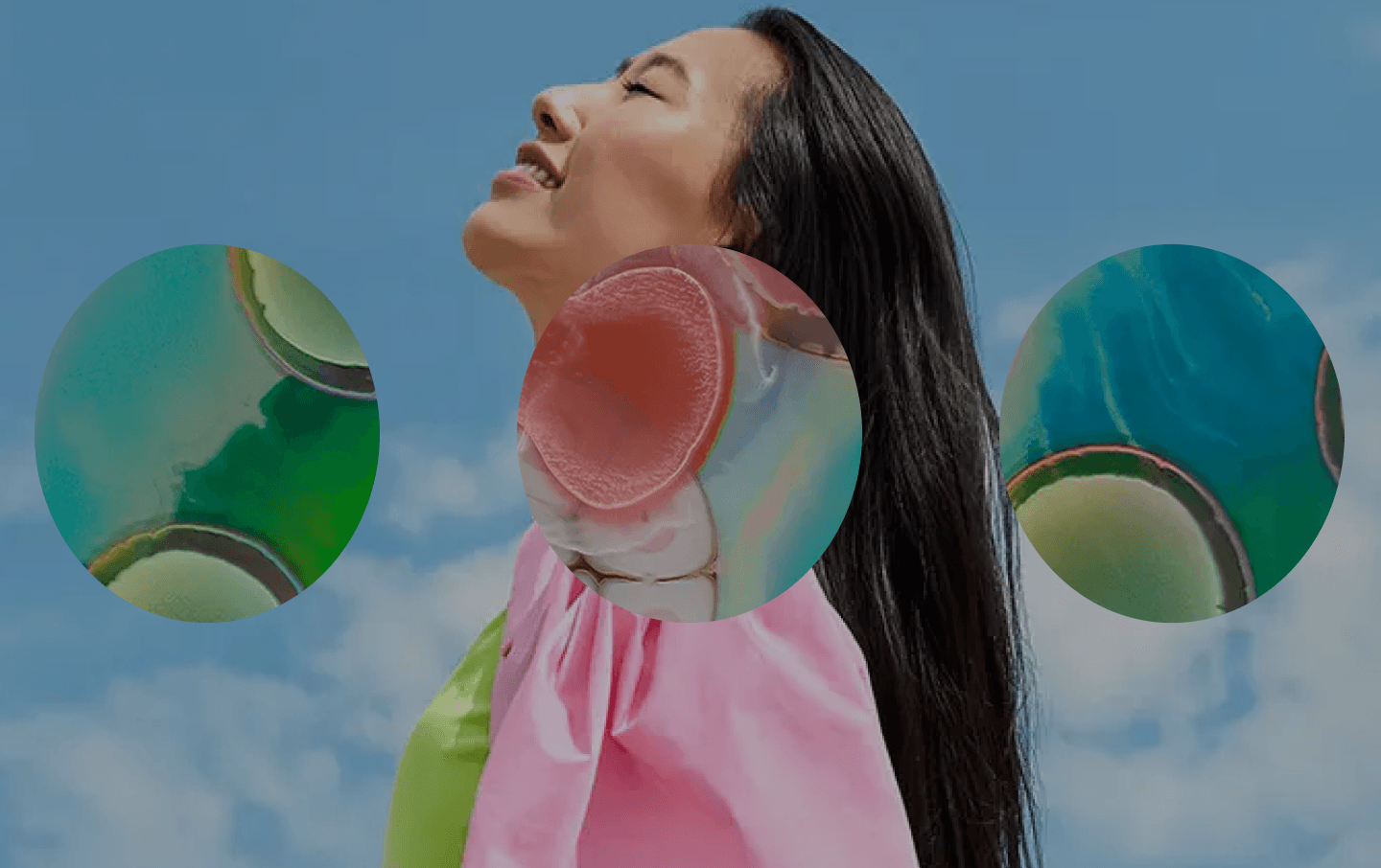
Implicit Cognition Testing: Understanding true psychological engagement
We ran implicit cognition tests for Rijo to see which of their marketing materials customers would associate most with sustainability, and which materials would be most engaging. From the results we were able to explain to Rijo the exact imagery and associations that would enhance their customer relationships, through increased acquisition and loyalty.

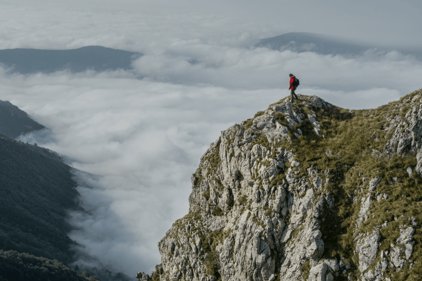
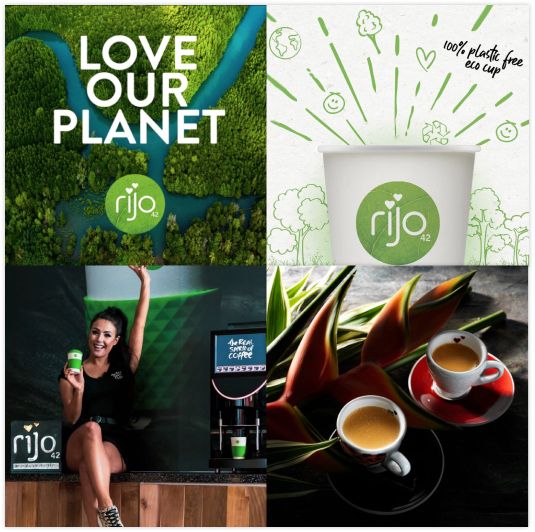
Humans are seen as unsustainable
We analysed participants’ explicit and implicit responses towards Rijo’s marketing materials and established which imagery was seen to be more sustainable. Images which contained a human holding a cup were not strongly associated with the concept of sustainability. Whereas, imagery with natural backgrounds (forests, hills, water, grass), performed better and evoked the desired mental association to sustainability and eco-friendliness.
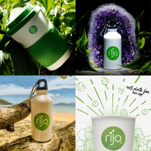

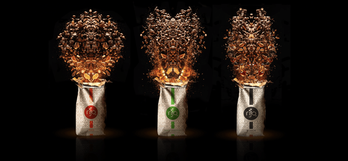
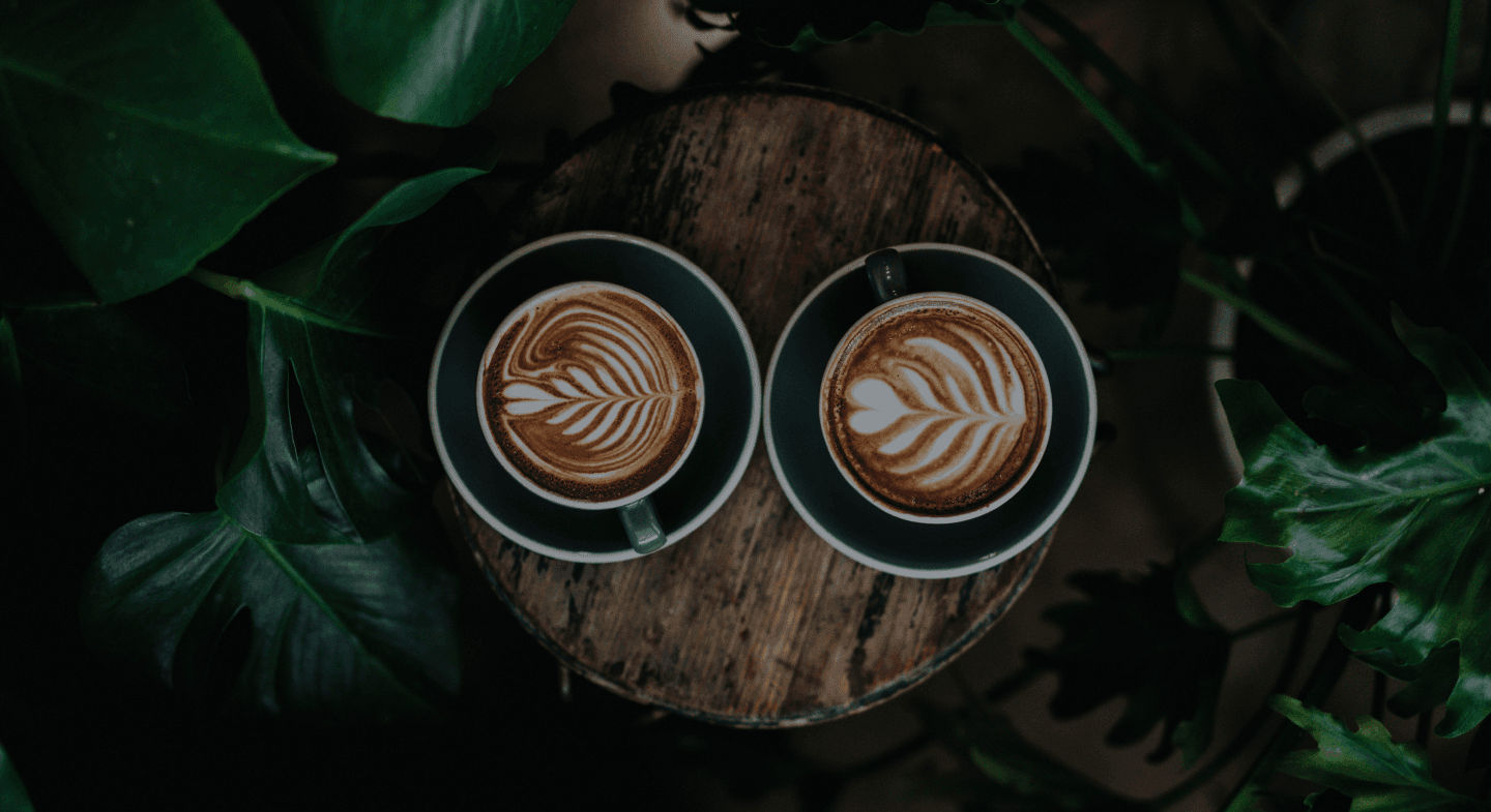
Light colours grab attention
Our second test evaluated which package design would most effectively draw attention. Our results showed that paper packaging in front of dark or complex background was not particularly attention grabbing. Instead, participants were drawn to imagery with light coloured products and simple light backgrounds. If Rijo needs to grab their customers' initial attention in an overcrowded market, and increase customer acquisition, this is an important insight!

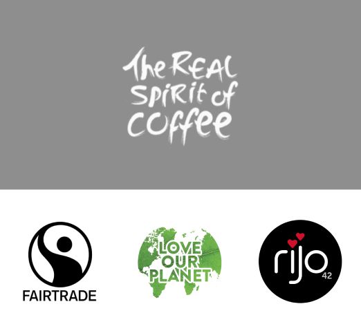
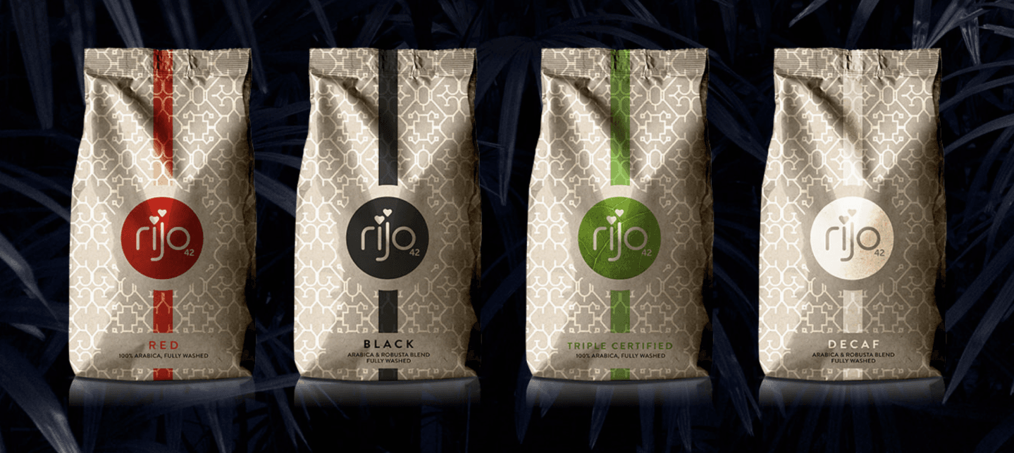
Simple and high contrast logos win out
Our last test was used to evaluate the emotional capture of logos. The insights showed that logos which have strong contrast and simple geometry grabbed the most attention. From this, we determined that using Rijo’s logo with a plain background rather than their leafy logo is more effective at grabbing customer attention initially. Likewise, using high contrast partner logos do a better job of drawing in initial attention than those with softer colours and more detail.