Revamping a popular online guitar coaching platform
Justin Guitar, is a world renown guitar coaching and teaching platform that has helped millions of people learn to play the guitar. To maintain its leading edge and grow in the aggressive market, the experience needed to take on a significant evolution.
The Challenge
Creating a sleek experience for the world’s most popular online guitar teacher
Justin’s popular and free online platform was experiencing high student drop-off’s and negative reviews. Students were finding it painfully cumbersome to navigate and find the desired content amongst more than 1000 videos, tasks and courses. So Justin needed our help to streamline the experience and help his business grow.
Motivating students through design
Users were getting frustrated, with the navigation and ability to find content on the site, damaging the growth of his business. Our challenge was to reduce these frustrations through engaging visual designs and intuitive information architecture.
Keeping students engaged
The research highlighted that many beginners were quick to drop off their courses, because they couldn’t find the right conten, and the website was tricky to navigate. Meaning there was a lack of motivation for beginners to transition to the advanced courses, we needed to visually engage with their motivations to keep them progressing with the course.

The Solution
Gamifying the learning process, through an insight-led approach
From our previous mixed method research project, we had tangible design recommendations that we validated would reduce user frustrations. The site needed a new visual identity which made users feel calm and inspired, and gamification to encourage and motivate users to continue to learn.
A deep dive into the customer’s online learning experience
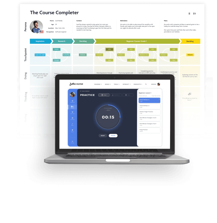
From our research, and data analysis, it was clear that the user experience was the biggest cause of bad reviews. Through validated user persona’s and journey maps we were able to streamline the site’s navigation, improve core search functionalities, and include gamified features that would prompt and encourage users to complete their learnings and courses.

Using Emotional Design to make learning easier
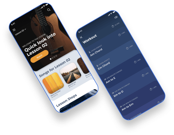
The site needed an extensive visual redesign that would guide students through a course easily and would automatically remember where they left. From our research it was clear that users needed a dashboard with a built-in practice tool, and progress bars to allow better visualisation of course progression and to encourage them to return and continue learning.

Rapid results using a winning approach
Using a fully agile sprint-based approach, we were able to break the site into priority areas so we could learn, prototype and test UX and UI in a real-time environment. By utilising the 1000s of users who visited the site every day to validate and confirm if the improvements were positive or required further enhancements.


Happy Clients
Testimonial
I knew I could rely on the team 100%
If you suspect there is something wrong with your website, I would definitely recommend getting the Pomegranate team involved, the research they can do into user experience and emotional connection with your audience is super powerful!

Justin Sandercoe
CEO of Justin Guitar


