Increasing conversions for an online rural broadband provider
Gigaclear prides themselves on bringing affordable, ultrafast broadband to rural communities that have historically struggled with getting good connectivity.
UX Strategy + Wireframes
UI Design
Web Development
Branding
E-Commerce
The Challenge
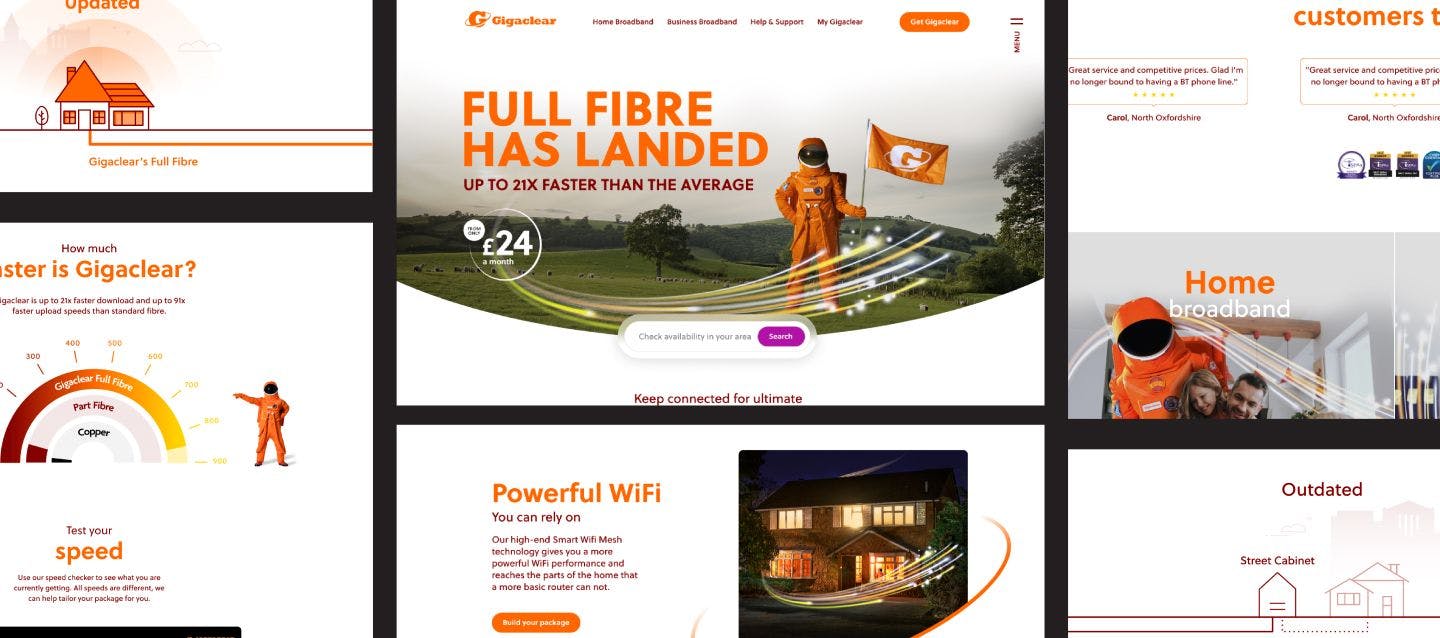
Pushing Gigaclear to the forefront of the industry
Gigaclear were experiencing a high number of drop-offs and were in need of our help to identify how they could increase online conversions, and engagement and reduce call centre calls, through an intuitive and easy-to-use online buying journey.

Increase sales opportunities
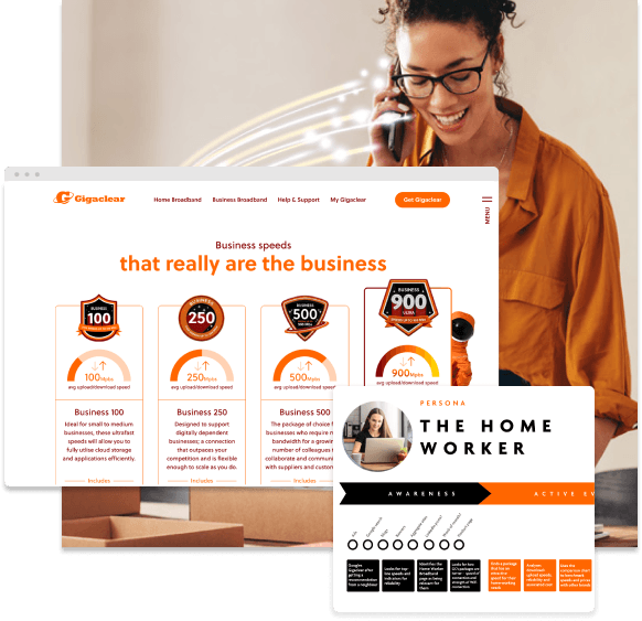
The challenge was to understand how to engage all the varying ranges of Gigaclear customers from the researchers, the purchasers, the loyal customers through to business owners, all in one journey. All of which had different needs, in different locations with different budgets.

Reducing bounce rates
We needed to prompt users to take advantage of other deals and additional services that Gigaclear offered, without further increasing the bounce rate and causing user frustration.


The Solution
Strengthening relationships
Our goal was to go above and beyond creating just an intuitive user interface design. We wanted to provide Gigaclear with an advanced behavioural understanding of their customers, allowing them to create an immersive online experience rather than a purely transactional one.

Motivations to purchase
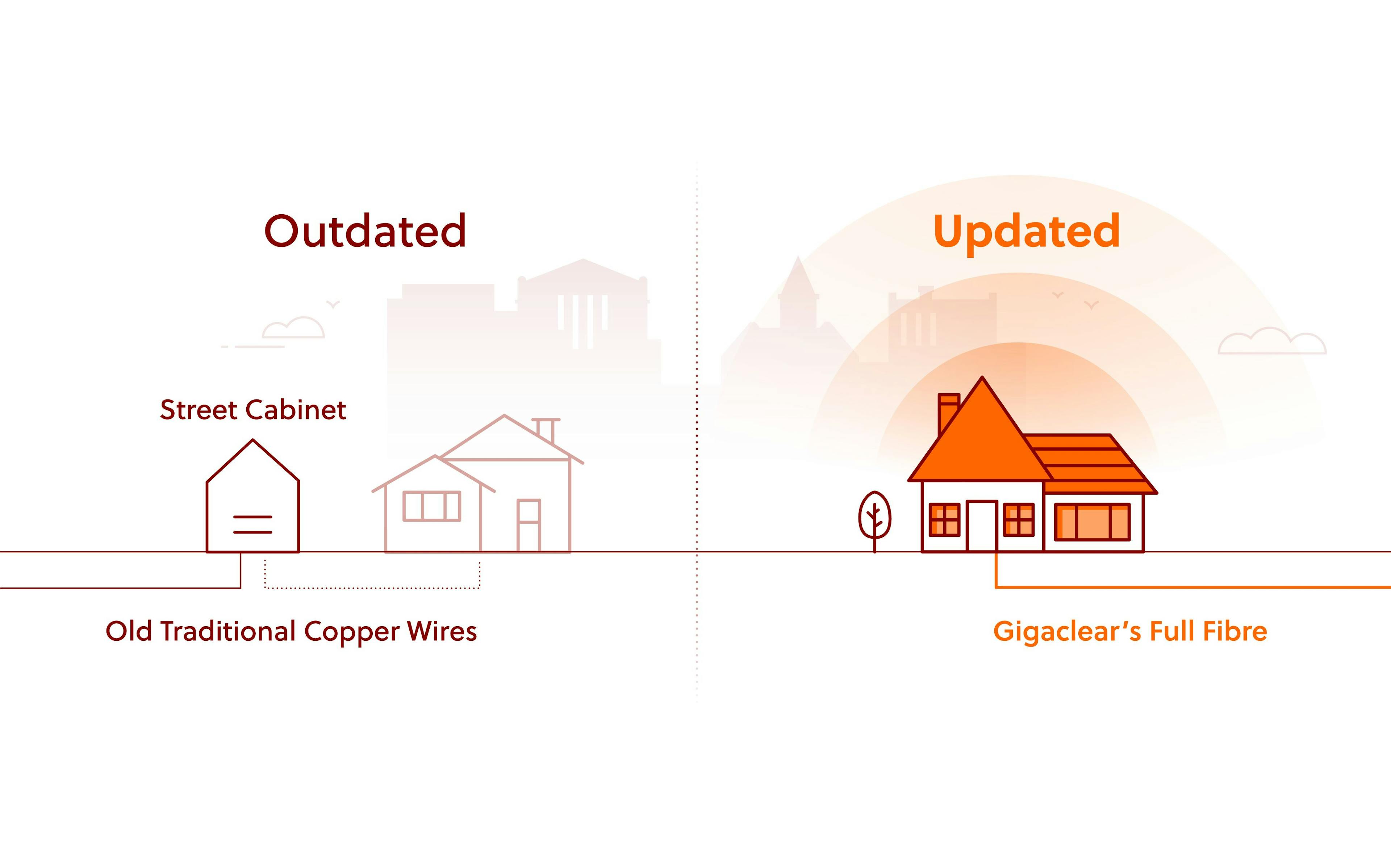
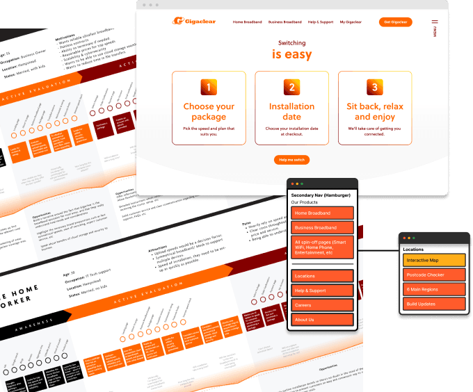
There are many technicalities with purchasing broadband online. Through qualitative and behavioural analysis we found that many users found the process daunting. Having created decision maps and user flows we were confident that the new information architecture, would provide users with the necessary information, empowering and engaging them throughout the lengthy checkout process, whilst not overloading them with information.

Know thy user
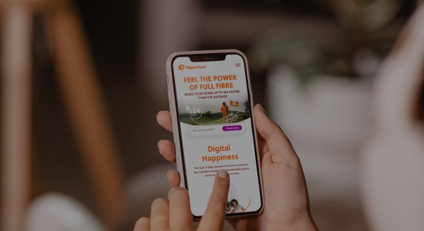
Our research informed us that users no longer take the time to analyse all the offerings on the home and broadband pages, instead they quickly scan information and go immediately to the checkout to understand pricing and the investment needed to purchase. This showed us the importance of creating a friction-free and easy-to-exit experience for the user.

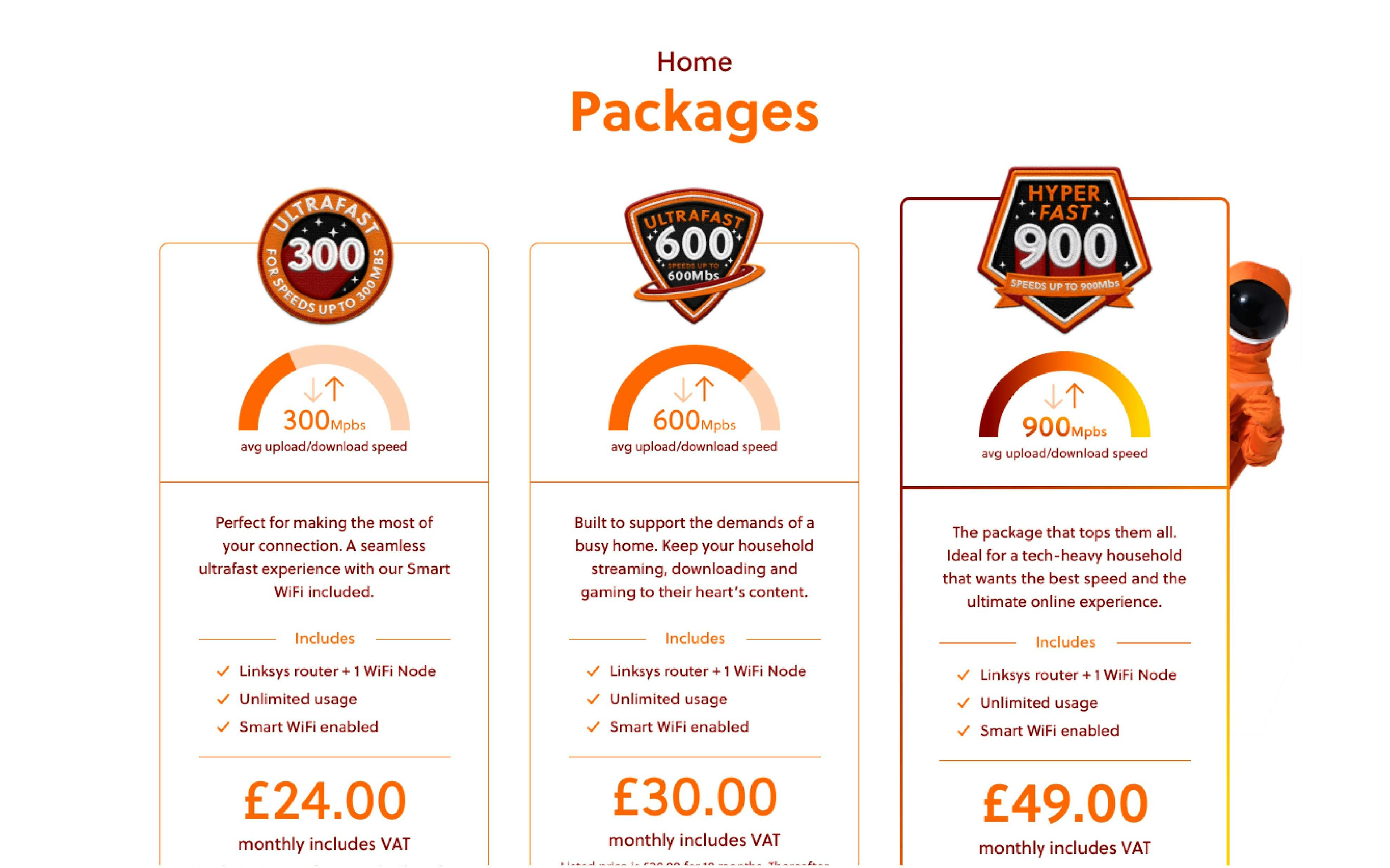
Meeting business and customer goals
A clear business objective for Gigaclear was to ensure customers were exposed to add-ons throughout the checkout. During interviews, users voiced their opinions on their general dislike for add-ons, so we had to find a happy medium. We crafted a checkout process that allowed users a friction-free experience so they could purchase and explore, with the option to fully skip to help reduce bounce rates.