Step into a world where every hue holds the power to shape perceptions and influence decisions. Did you know that, According to WebFX, it takes around 90 seconds for a person to form a judgement about a product or a new environment. Based on the results of their study, it’s thought that 62% – 90% of that initial impression is based on colours. While it's widely acknowledged that colours evoke specific emotions in design, we’ll take a look at how the application of colour psychology to craft enhanced user experiences. We aim to unravel how strategic colour choices can positively influence emotions and behaviours, aligning seamlessly with our focus on shaping user interactions.
In this article, we delve into the fascinating realm of colour psychology in UX design and explore how its thoughtful application can contribute to creating better experiences for businesses and their customers.
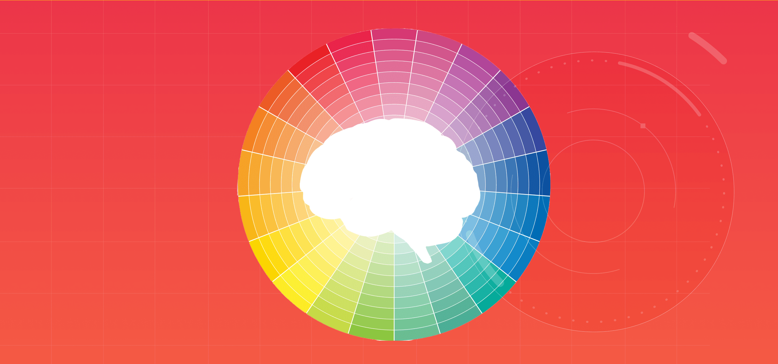
Understanding Color Psychology:
Colour psychology is the study of how colours affect human emotions and behaviour. Different colours evoke distinct psychological responses, and understanding these responses is crucial in the context of UX design. Here's a brief overview of some common colours and their associated psychological impacts that you may not have know about:
While colours can have a variety of meanings, they still need to be strategically used in order to effectively communicate a desired message and influence user behaviour. The thoughtful application of colour in design, particularly in the realm of user experience (UX), is a nuanced process that goes beyond mere aesthetics.
1. Brand recognition through consistency:
Brand recognition, a pivotal aspect of consumer engagement, is the ability of a brand to be easily identified and remembered by its audience this can be achieved through:
Consistent Colour Palette: Establishing brand recognition relies heavily on a consistent colour palette. The choice of colours should align with the brand's identity and remain uniform across all platforms and touchpoints. Logo and Visual Elements: Brands like Coca-Cola maintain a distinct red colour not only in their logo but also in various visual elements, creating a cohesive and instantly recognisable brand image.
2. Trust building with blue:
At the heart of successful brand-customer relationships lies the concept of trust, a foundational element that embodies reliability, credibility, and assurance. To achieve this business can: Using Dominant Trust Colours: Blue's calming effect is harnessed to build trust and credibility. Financial institutions, such as Chase or American Express, use blue as a dominant colour, reinforcing a sense of security and reliability. Strategic Application: The strategic application of blue in buttons, backgrounds, and important interface elements conveys a commitment to a secure and trustworthy user experience.
3. Hierarchy and information organisation:
Hierarchy, a structural arrangement of elements, whereas information organisation, the systematic categorisation of content. These serve as the blueprint for a coherent and user-friendly experience, to achieve this businesses can:
Contrast for Emphasis: Colour contrast is a powerful tool for guiding user attention. Designers use contrasting colours for critical elements like buttons, making them stand out against the background and creating a clear visual hierarchy. Colour-coded Information: Websites like Trello use colour-coded labels to categorise and organise information. This not only aids in hierarchy but also enhances user comprehension and navigation.
4. Cultural sensitivity:
Cultural sensitivity is the understanding and respect for the diverse cultural contexts that shape our perceptions. Businesses can incorporate this understanding through:
Research and Adaptation: Brands operating globally must conduct thorough research on cultural colour associations. Adobe, for instance, adapts its marketing materials to suit regional preferences, ensuring that colour choices resonate positively. Localisation of Colour Schemes: By localising colour schemes, brands can avoid unintentional cultural misunderstandings and enhance their appeal to diverse audiences.
5. Target audience considerations:
The concept of target audience is an approach that revolves around tailoring brand communication to a specific demographic. For example:
Age and Demographics: Understanding the demographics and age groups of the target audience is vital. Social media platforms targeting younger audiences, like Snapchat or TikTok, often incorporate vibrant and bold colours to align with youthful preferences. Psychological Impact: Kid-friendly apps, such as those designed for education or entertainment, use a playful and colourful palette to create a visually engaging and stimulating environment.
6. Contextual adaptation:
Contextual adaptation, within the realm of design, refers to the practice of tailoring visual elements to seamlessly align with specific platforms or environments. For instance:
Adapting to Platform Dynamics: Different platforms may require different colour strategies. Instagram, a visually-centric platform, uses a subdued colour scheme to allow user-generated content to shine. This adaptation ensures harmony with the platform's overall aesthetic. Dynamic Contextual Colours: E-commerce platforms often use dynamic colour changes to indicate stock availability or promotional pricing. This contextual use of colour aids users in making informed decisions during their journey.
In summary, skilful application of colour psychology in UX design transcends aesthetics, becoming a strategic tool for businesses. Mastery in leveraging colours for trust-building and brand recognition enables the harnessing of psychological impacts, leading to immersive and meaningful user experiences. Our commitment aligns seamlessly with this approach, offering businesses the means to shape compelling interactions through strategic use of colour. If you would like to find out more on how we do this click here