
It is estimated that about 71% of baskets are abandoned mid-way through the shopping process - due to complicated checkout flows with unexpected costs, tedious forms and registration processes. This could be a massive blow to online stores, as it’s estimated that the e-commerce industry loses billions of sales due to basket abandonment each year.
So what makes some checkout journeys uniquely satisfying and motivating?
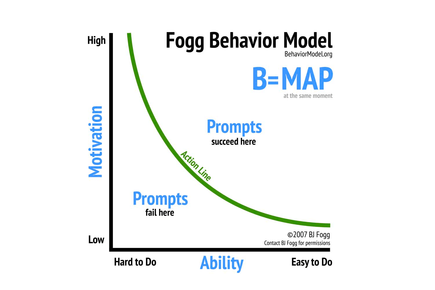
The answer could be in a framework called Fogg’s Behaviour Model. While behaviour is incredibly complex and challenging to predict, FBM could provide us with a way to design a frictionless and persuasive online shopping experience.
The framework posits that Behaviour = Motivation x Ability x Prompt
The sweet spot is the upper right quadrant - high motivation + high ability. If someone has high motivation but low ability, we’re likely to be left with a frustrated customer.
Alternately, low motivation with high ability could result in a reluctant customer. Someone with both motivation and the ability to complete the task is the ideal candidate for a behaviour prompt that ultimately results in a conversion.
So what does a good example of Fogg’s Behaviour Model look like?
The Amazon’s checkout process
Right from the first Amazon promotional email to the checkout process on the website, all the relevant elements for Fogg’s Model are in place. The promotional email tailored to show products you’ve previously shown interest in acts as a motivation and a prompt.
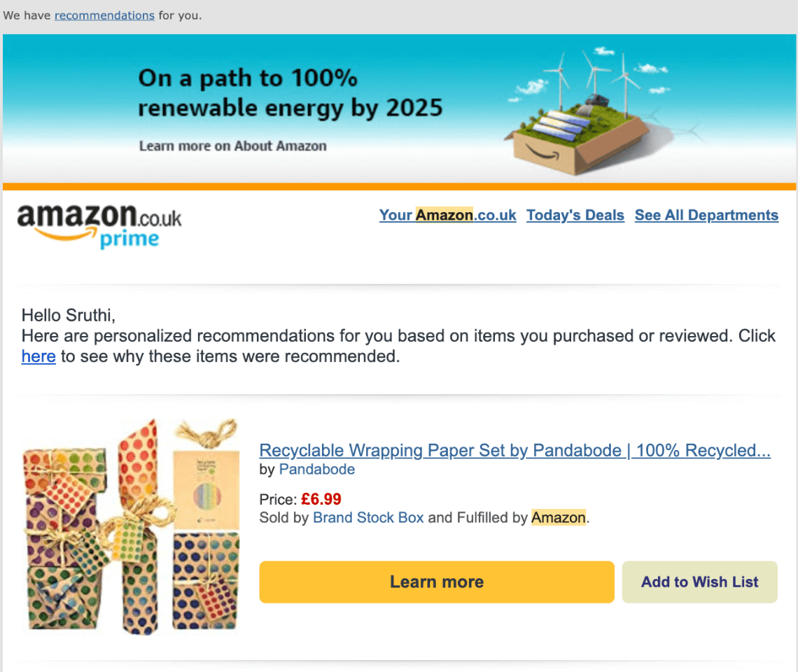 When you click on it and get taken to the product page, you’re then able to see the images, ratings and reviews. All of these serve to increase your motivation.
The ‘Buy Now’ button acts as the prompt, and Amazon’s checkout process ensures an effortless checkout in just a couple of clicks.
(With certain Amazon-compatible products like an Echo device, Amazon goes 1 step further in increasing ease of use by even auto-linking the Echo device to the Amazon account for a faster setup process)
Focusing on Ease of Use
While most e-commerce experiences have these elements present to some degree, it highlights the need to improve the components lacking from the FBM to provide the ideal online shopping experience.
We can anticipate that anyone entering an e-commerce website already has the motivation and some intent to purchase, thanks to well-placed marketing or various other factors. Motivation is also the most challenging factor to influence in the scenarios lacking it.
Ability, combined with the correct prompts, is the element that is the easiest to influence in this model. Therefore, ensuring an easy, intuitive and frictionless checkout process for customers is crucial.
So here are some tips on reducing friction and increasing ease of use.
The start of a checkout process
The checkout process starts as soon as someone adds something to the basket. Therefore, one of the most fundamental design considerations is to make it exceedingly clear and obvious when an item is added to the basket. The lack of feedback through animation or a confirmation text element is a common pitfall for many e-commerce sites.
Who’s doing it well? Gruum:
When you add an item to the basket, there is a sliding component that gives clear feedback that a product has been added, along with additional details such as price and quantity and the option to View Basket or Checkout.

A clear display of cart contents
Another essential consideration is ensuring customers don’t have to think hard about what we’re showing them on the website. Therefore, the checkout process must clearly indicate what items are being purchased in what quantity, style/colour/size, and includes Returns Policy and all the necessary product details.
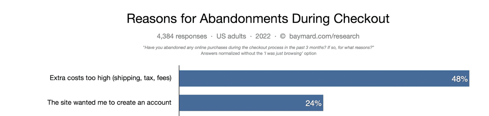
Most importantly, we can be transparent and upfront with customers by showing prices throughout the shopping process. ‘Hidden’ fees through taxes or shipping costs are the most widely recognised pain point for customers resulting in nearly half of all shopping cart abandonment, according to the Baymard Institute.
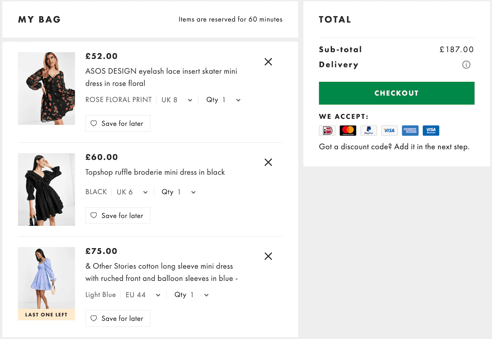
Asos has a clear checkout experience that captures all the essential details about the products selected and the costs up to this point.
Don’t scare shoppers off.
Many e-commerce stores expect shoppers to register for an account before completing the checkout. Forced registrations are the second leading cause of shopping cart abandonment, accounting for about 24% of all shopping cart abandonment in 2022 (Baymard Institute).
Offering shoppers ‘Guest Checkouts’ goes a long way in creating a checkout experience that increases the ability of shoppers to breeze through the checkout process.
Conclusion
If you are looking for ways to increase engagement and conversion on your e-commerce website or app, get in touch with us at Pomegranate. We would love to apply behavioural design to craft an addictive and engaging e-commerce experience that is destined to convert.