
Duncan Thomas, Co-Founder, CEO and Head of Innovation at Pomegranate
Most health brands read a bug backlog as an engineering problem, and fix it accordingly. But the reality is that customers don’t file poor UX as a UX complaint. They file it as doubt about whether the product works, which means the damage lands on your evidence, your pricing and your roadmap while the actual cause goes unnamed. In this blog, Duncan Thomas, founder of Pomegranate, breaks down what that really means for health brands.
Ask consumers what would break their trust in a health brand and only one in five points at the website. Look at the underlying data of what actually changes their mind and the fundamental experience through the site is a big issue for almost two thirds of people. That gap is the most expensive blind spot in consumer health, because a problem nobody can name is a problem nobody gets the budget to fix.
In this article
- Why your customers blame the product when the build is at fault
- Why a broken form costs more in health than in retail
- What we find when we audit a health brand’s digital experience
- Why a working site is now the baseline, not the differentiator
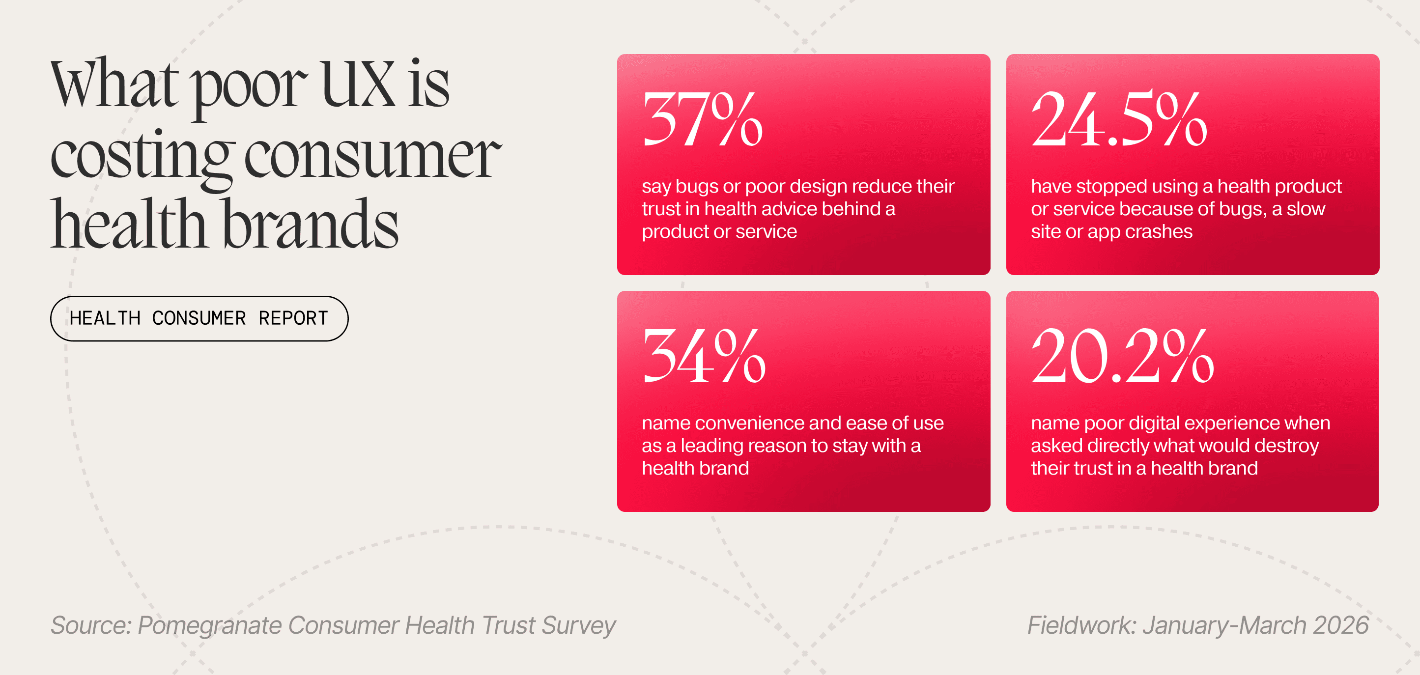
Our research into consumer health trust found that 63% of digitally active UK users aged 18 to 44 say bugs or poor design reduce their trust in the health advice behind a product or service, and that 25% have stopped using one outright after persistent bugs, a slow site or app crashes.¹ The obvious reading is that health brands have a technical hygiene problem and should go and fix their builds.
The consumer health trust study is self-reported, from a paid panel of 188 digitally active UK consumer health users aged 18 to 44.
That reading is not wrong, but it is too micro in focus and misses the biggest danger. Clearing a bug backlog is an engineering job most teams can do, and it doesn't bring back customers whose confidence has already gone. They left without leaving a clue, because only 20% name poor digital experience when asked directly what would destroy their trust in a health brand, while almost two thirds say bugs and bad design reduce it when asked a different way.¹ The damage is substantial, it is happening now, and your customers are filing it under something else entirely, which is how brands end up acting on price or product when neither was the problem.
Why your customers blame the product when the build is at fault
Nobody encounters a form that suddenly wipes itself and concludes that the interface has failed them. They conclude the brand is not worth believing, and they attribute that to the product.
Consumers are not running a conscious assessment of your front end. They are forming a judgement about your brand’s overall competence from whatever is in front of them, and the interface is in front of them continuously while the product’s proof and persuasive evidence is not.
A brand losing customers to its own build mistakes the symptom as scepticism about efficacy, so it buys more proof: further clinical copy, another certification, a stronger claim on the pack. None of it lands, because the argument was never the thing failing.
The mechanism is processing fluency. Reber and Schwarz found that identical statements were judged more likely to be true when they were presented in colours that made them easier to read, an effect their participants had no awareness of and could not have reported.² Ease of processing is read as a signal of truth, which is why a hard-to-use site makes the advice on it feel less credible, and why so few people can name that as the reason.
The applied research points the same way. A 2022 meta-analysis of 147 studies in the Journal of Medical Internet Research found that navigability, visual design and ease of understanding had the strongest relationships with how consumers judged the quality of online health information,³ and earlier UK work in Social Science & Medicine found that people rejected high-quality health information outright because of how it was presented, before examining the content in any depth.⁴
Your reporting should highlight the exit data, and where it does, it will tell you people left because the product did not convince them. Some of them left because your site did not, and neither your analytics nor the customers themselves can tell you which is which. How much that costs you depends on what you are selling, and health is the expensive one.
Why a broken form costs more in health than in retail
These are ordinary UX failures. We find them across every sector and site we audit, and they are no more common in consumer health than anywhere else.
In retail, a form that wipes everything you typed because a single field was wrong costs you a basket, and the customer, mildly irritated, comes back on Thursday. In consumer health, the same form is being filled in by someone who came looking for help with something that worries them, so the failure arrives as information about whether this organisation is competent to help. That is the escalation, and it is why the published work on health technology treats usability as a safety matter rather than a conversion one. The Department of Health and Social Care’s own guidance states plainly that poor usability can lead to failed adoption.⁵
 Quite possibly the most annoying thing to happen during your website experience.
The damage builds in tiers. Broken links and missing images trigger rapid abandonment, which is the visible tier and the one most teams already watch. A disorganised or unintuitive journey costs the first purchase and quietly lowers the chance of a second, which is far harder to see because nobody complains on their way out. The deepest tier is the one almost nobody measures, where the experience fails to support how people discover information, learn and build confidence over time, and digital hygiene stops being maintenance and becomes part of what sustains the relationship.
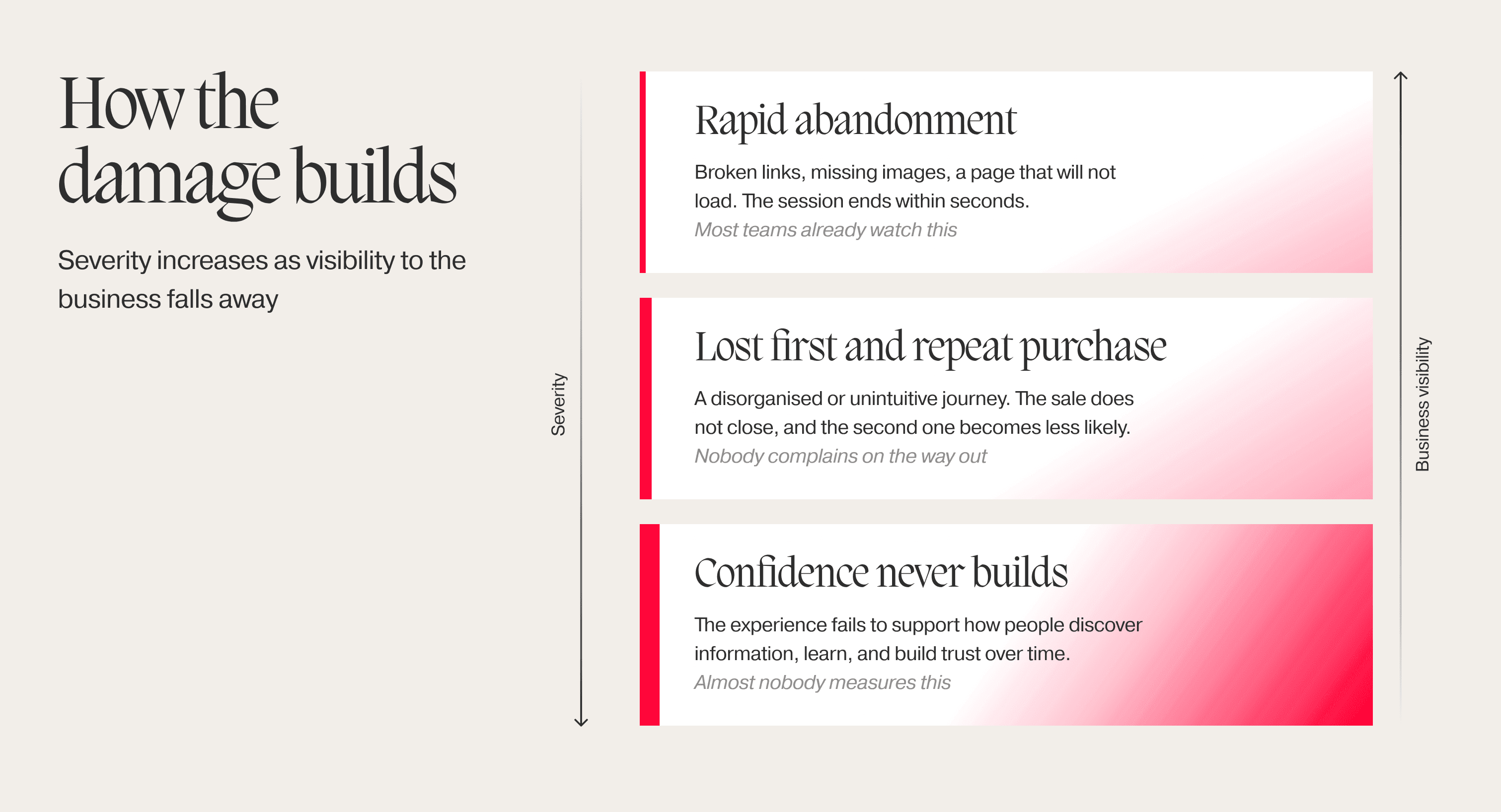
Our research shows one in four customers have already left a health brand because its technology failed them. Nearly two thirds are losing trust in the health advice itself and have not gone yet, which means most of the cost you will incur is still in front of you.
Your open bug list is actually a churn forecast.
What we find when we audit a health brand’s digital experience
Across audits of pharma, gut health and supplement experiences, we see the same design decisions recur. Each one breaks the brand’s own promise: personalisation that cannot explain its own results, support that punishes you for mistyping a date, and clinical authority that makes the dosage decision for you.
When results are returned without translation. A personalised report arriving with hyper-scientific terminology and no consideration for the lamen, provides diversity scores and reference ranges, with nothing translating them into a way your customers can understand. The value that matters are presented in the same weight, font and colour as everything else, so the reader cannot tell which number should actually concern them. Distinctiveness is what makes an item get noticed and remembered, an effect Von Restorff identified in 1933,⁶ and a screen with no distinctiveness anywhere gives the eye nothing to land on.
This was the brand’s moment to go beyond, to really engage emotionally and teach someone something useful about their own body, but instead the report rocks up ready for Phd doctorate to read and the value of building relationshiups foundations are totally lost.

Forms that punish the user for being human. Multi-field symptom trackers and intake questionnaires clearing themselves because one date was formatted wrongly, no progress saved, and an error message announcing an invalid entry without identifying which field or explaining how to fix it. The people filling these in are frequently anxious, sometimes unwell, and always being asked to disclose more than a retail form would dare request.
Pre-set defaults on dose, frequency and subscription. These arrive pre-chosen rather than requiring a deliberate selection, with subscription cadence defaulted to whatever suits the business. In regulated health technology that is treated as a use-error risk. In consumer health, it is treated as conversion optimisation, and it is the same design decision with the same effect, which is that a choice about what someone puts in their body was made by the interface.
Accessibility treated as a compliance checklist. Low-contrast type on dosage and contraindication copy, hardcoded sizes that will not scale at device level, and critical controls with touch targets that invite the wrong tap. Those are the failures a compliance audit catches, and clearing them is where most brands stop. What a checklist cannot measure is cognitive load. Some of the effort belongs to the task, because understanding a dosage schedule takes thought, but everything the presentation adds on top is spent from a budget your customer arrived with already depleted, since they came to you worried about something. Health literacy is the harder requirement, and NHS England reports that 43% of adults in England struggle with health information written in words, rising to 61% once numbers are involved.⁷ An instruction can pass every technical standard and still be written for someone who already understands it, so the interface has to translate for understanding as well as for language and device.
Every one of these is cheap to fix, and they survive because nobody looked again after launch. That is a decision about when a site counts as finished.
Why a working site is now the baseline, not the differentiator
Plug-and-play platforms have made launching a health brand fast and cheap, and have eroded the value of brand differentiation along with it. A professional-looking site signals nothing when your competitors all look practically the same.
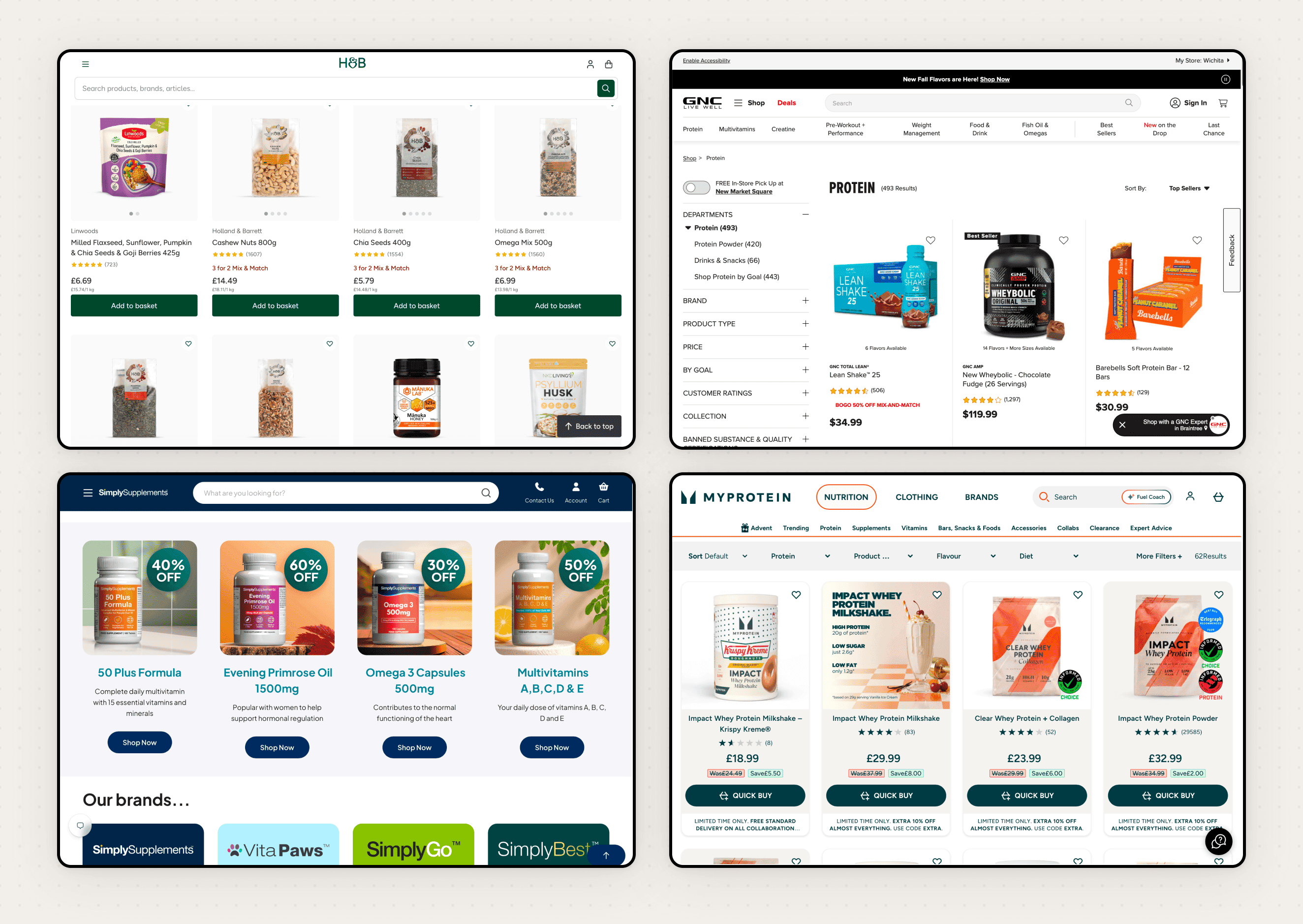
Familiar layouts, stock trust signals and near-identical conversion journeys give consumers fewer visible reasons to rate one brand above another, so when a fault appears on a journey that already looked generic it confirms an impression rather than contradicting one. Ease of use is doing more retention work than most brands credit it with, with 34% naming convenience and ease of use as a leading reason to stay with a health brand,¹ and convenience is exactly what a template delivers least well, because its friction is identical everywhere it is deployed.
These failures rarely come from a lack of budget. They come from the criteria a team uses to judge a design complete, so those are what have to change. In practice, that means testing the critical journeys with real people before launch and continuing to watch them afterwards, because a sign-off is a moment and an experience is something that degrades. It means making authorship, sources, data practices and support routes easy to find, since the failures that cost you a sale are the same ones that cost you the confidence people need before they will hand over anything personal. And it means treating accessibility and reliability as measures of trust, because that is what decides whether they still get attention when the roadmap gets tight.
None of this is glamorous work, and none of it will appear in a brand book, but a working site is now the baseline every competitor has already reached. The brands that get past it are the ones that stopped treating the experience as packaging around their evidence and started treating it as evidence in its own right.
A working site is not a feature you ship. It is the evidence your customer is actually reading.
If you want to design a digital experience that earns trust rather than quietly spending it, let us show you the new realm of experience design.
References
- Pomegranate (2026). Building Trust in Consumer Health. Survey of 188 digitally active UK consumer health users aged 18 to 44, recruited via paid panel, fieldwork January to March 2026.
- Reber, R. and Schwarz, N. (1999), Effects of perceptual fluency on judgments of truth, Consciousness and Cognition, 8(3), 338 to 342.
- Zhang, Y. and Kim, Y. (2022), Consumers’ Evaluation of Web-Based Health Information Quality: Meta-analysis, Journal of Medical Internet Research, 24(4), e36463.
- Sillence, E., Briggs, P., Harris, P.R. and Fishwick, L. (2007), How do patients evaluate and make use of online health information?, Social Science & Medicine, 64(9), 1853 to 1862.
- Department of Health and Social Care (updated 2021), A guide to good practice for digital and data-driven health technologies.
- Von Restorff, H. (1933), Ueber die Wirkung von Bereichsbildungen im Spurenfeld, Psychologische Forschung, 18.
- NHS England, drawing on Rowlands, G. and others (2015).